How did we make the map?
How did we make the map?
First step: Associate anonymized IDs with a political orientation
Second step: Describing the political profile of Copenhagen-based venues
Third step: Place the venues on a diversity index
Fourth step: Anonymization
Fifth step: Create an overview the political character of physical blocks
How did we make the map?
The map of Copenhagen is built on data from the project ‘The Danish Facebook Atlas’, which has collected digital traces from 69.000 Danish Facebook pages from 2012 to 2018. All pages are public pages; thus, no data is collected from either personal profiles or groups. Furthermore, the database is anonymized, is GDPR registered, and the users’ names and demography have been deleted. Denmark is estimated to have approximately 3.3 million facebook users, of which 2.4 million are active on a daily basis. The country has a population of around 6 million people. The main bias in use concerns age as people above 65 are less likely to use Facebook than other age groups.
Since the dataset contains anonymized IDs, it has been possible to expose patterns in the way these anonymized users interact with both political content and events in Copenhagen on Facebook. It is such interactions that constitute the foundation for the diversity matrics, that lies beneath the map you can explore on this site. In the map we have given 5000 places in Copenhagen (eg. bars, sports venues, music venues, shops and public squares) a color signalling the political leaning of their crowd. More details on the color scheme will be given below.
We have taken several steps to ensure that the information transferred from ’the Danish Facebook Atlas’ to our project cannot be traced back to specific user profiles that might be available on Facebook. For instance, we refrain from looking at political characteristics at the event-level (we only look at aggregations on places) and that we have anonymized places with less than 50 users. This includes locations where a particular political group makes out the majority of the overall audience. Also, we are open to anonymize more dots on the map if the places should contact us with such a request.
Below is a description of the five methodological steps we have taken to construct the map and prevent de-anonymizing.
First step: Associate anonymized IDs with a political orientation
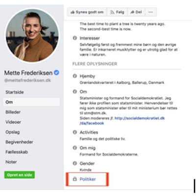
First, we associated anonymized IDs with a political orientation. This association is based on their engagement with content on political Danish Facebook pages. The Danish Facebook Atlas has data on approximately 700 pages, which identify themselves as ‘political’. These can be pages of individual politicians, as in the example below, or pages from political parties’ regional and local branches. Together the 700 political pages have produced 297.334 posts between 2012 and 2018.
If a user has interacted more than two times with content on the political pages, we categorize this user as being politically interested. More than 600.000 unique Facebook users have done that between 2012 and 2018. We are not interested in who they are. We are interested in the way they use emojis such as hearts and likes to signal agreement with content from the three political blocks in Danish politics. The red block is the socialist/social democratic/green liberal block and is comprised of five political parties. The blue block is the economically liberal block and is comprised of three political parties. The yellow one is the anti-immigration block and is comprised by three political parties. This way of dividing the Danish political spectrum is standard in political analyses of Danish elections. Our assumption is that a positive response on a political post signals that the user agrees to the message, and by that supports the political idea expressed. In contrast, other emojis, such as angry and crying smileys, are more ambiguous so we left them out of the measure.

Based on their distribution of positive emojis, we have given each anonymized ID a metadata signalling their political belonging. If a user has more than 60% of their positive interactions within one political block, we take the user as supporting that political block. If a user does not have 60% of their positive interactions within one political block, we say that they do not belong to one orientation, and the user will not be assigned a political color.

When we look at the political distribution of the 600.000 users, we get the following distribution of the users that has a political leaning. 54% is supporters of the red block, 36% supports the blue block and 10% supports the yellow block.

Second step: Describing the political profile of Copenhagen-based venues
After having associated the 600.000 anonymized IDs with a political bloc, we looked at their engagement with events in Copenhagen. In Copenhagen there has been approximately 150.000 public events on Facebook between 2012-2018. These events covers everything from big concerts to smaller events such as soup kitchens. We have, once again, only looked at public events, and strayed away from private events.
For each of the 150.000 public events, we have pulled a list of anonymized IDs on the users who have either indicated that they ‘participate’ in the event or are ‘interested’ in it. Even though we don’t know if these users have been there physically, they have signaled to their Facebook friends that it is an event they could imagine participating in. In this way, they have indicated that they identify themselves with it and consider it an urban space that could potentially be in.

Out of our 600.000 political users, about 300.000 have engaged with events in Copenhagen. If we look at the political characteristics of these users, it has clearly changed compared to what we saw earlier. The red ones are more prominent, which tells us that the politically engaged users, who are active on Copenhagen events, have particular red political preferences. Compared to the actual voting by Copenhageners in the three parliamentary elections held during that time, the red block is slightly over represented, and the yellow is somewhat underrepresented in our data.

By looking at the overlap between political engagement and event engagement, it has been possible to create a political profile for each event in Copenhagen. As an example, if we take the 1000 anonymized IDs attending or showing and interest in the concert above, we first count at how many of these we can rediscover in the political dataset. We then add metadata about the political preferences of these ID’s. When aggregating all event at a venue, the result is a political profile as seen below. The concert venue is called 'Lille VEGA' and only 25% of the users attending events at this venue are politically interested. Accordingly, the venue has a quite low 'political charge'. The waffle chart shows the distribution of the political crowd. Hovering over the chart one learns that the venue attracts 79% red supporters, 19% blue and only 1% yellow.

Third step: Place the venues on a diversity index

Based on these calculations, we can finally assign each venue a political category. If an venue belongs to the most diverse quartile in Copenhagen, we say that it is a ‘diverse’ venue and mark it green. If more than 70% of an event’s loyal political crowd is from a particular block, we say that the event is dominated by that political block, and it will be colored either red, yellow, or blue depending on the character of its political leaning. If a venue does not fall into any of the categories, it is of lower interest for our analysis, and we, therefore, color it grey. For instance, because Lille VEGA political crowd is so heavily dominated by the red block, this venue is colored red on the map.

Fourth step: Anonymization
We chose to anonymize venues with less than 50 participants or if one political block has supporters from more than 75% of the total crowd at a venue. In these cases we reasoned that there would be a minor opportunity to actually infer the political leaning of a specific person by looking at the list of events attendees on the online version of Facebook. Though these criteria we anonymized more than 400 venues in the map and they appear as shows below.

Fifth step: Create an overview the political character of physical blocks
The last step in the map design was to produce a superjacent layer that makes it possible to say something about the diversity across areal districts of Copenhagen. Instead of visualizing the specific places as dots, we have divided Copenhagen into its physical blocks. This block layer is a summary of the places in that block.
In the same way as above, we use the total crowd across all places in a block to create its political profile. The top layer of the map shows the differences in the various blocks’ diversity scores, which are calculated using the same method as above. We have thus colored the different blocks depending on where they are located on the diversity index. Green indicates a high diversity, whereas red, blue and yellow indicates a political bubble.

When you look at the block map, there is also information available when you hover over a particular block. However, here we entirely focus on the area’s political charge and the diversity score, which we have chosen to show over time. It can provide an idea of the overall development in the area before you zoom in and see the political distribution in the actual places that make up that development. Looking at the block in which Lille Vega is placed we see that this is a physical urban space that have been stable in having a low political charge and a low diversity across the years.

We hope that you now have a foundation to interpret what you see on the Copenhagen diversity map.
If you have any questions for the method, you are more than welcome to write a mail to Anders Koed Madsen using this address: akma[at]hum.aau.dk